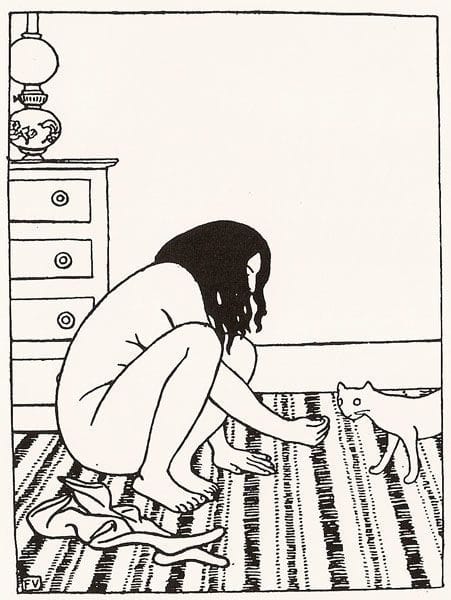

Woman and Cat
Felix Edouard Vallotton
"This one is most notable for its contrast with the other much more black images (not just in my selection but across his graphic works that I’ve seen). Perfect placement of the black hair. Great flat dresser/lamp at the left. Excellent use of the large white space in the upper right." (http://madinkbeard.com/archives/felix-vallotton-in-high-contrast)
Uploaded on Dec 5, 2014 by Suzan Hamer
Arthur
coming soon